
COMPANY NEWS


2017 NEW BRANDING
Jinan North Welding Tools Co Ltd new logo and image
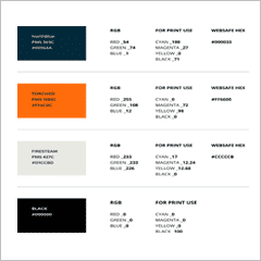
Regarding our colour….. Our new North logo reflects the long-standing tradition and intelligence as a brand. The use of PMS303C denotes the loyalty to Mr Mao’s founding choice of blue. Representing trust, wisdom and tranquillity.
Behind the characteristics of the colour, we have chosen to pair loyalty with the colour of orange. From the Chinese culture, orange represents balance, happiness and joy. These correlating colours bring creativity within a person or organization.
With respect to our colour choice we have also utilized neutrals to strengthen our colour palette.
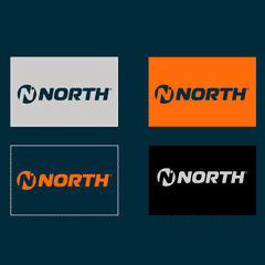
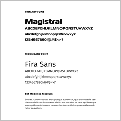
As to our new shape….. A representation of our mission, goals and valued principles. Utilizing a wide typeface that reflects strength, balanced by colour and shaped with our circular icon of unity.
Our die cut circular icon expresses unity in our brand. A die cut letter N for the first letter of our company. A full circle on the up right of the letter N, creates balance for singular use and also reflects the direction of North.
We have enjoyed putting this together. There is only one way up; NORTH.